DCG ONE
SaunaSpace
Visual Identity | Web Design | Illustration | Icon Development | Photo Art Direction
Art director: Eliza Young
UX strategist/designer: Kelsey Hager
Content strategist: Ashley Laabs
Developer: Kevin Bolduan
Created at: DCG ONE
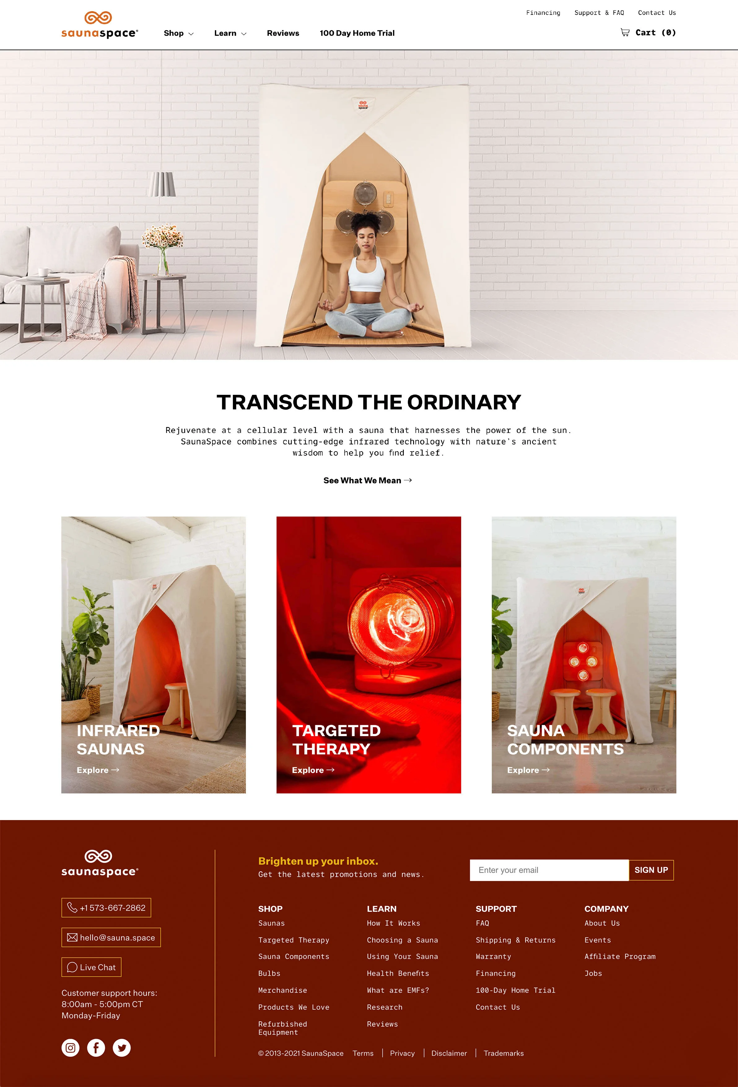
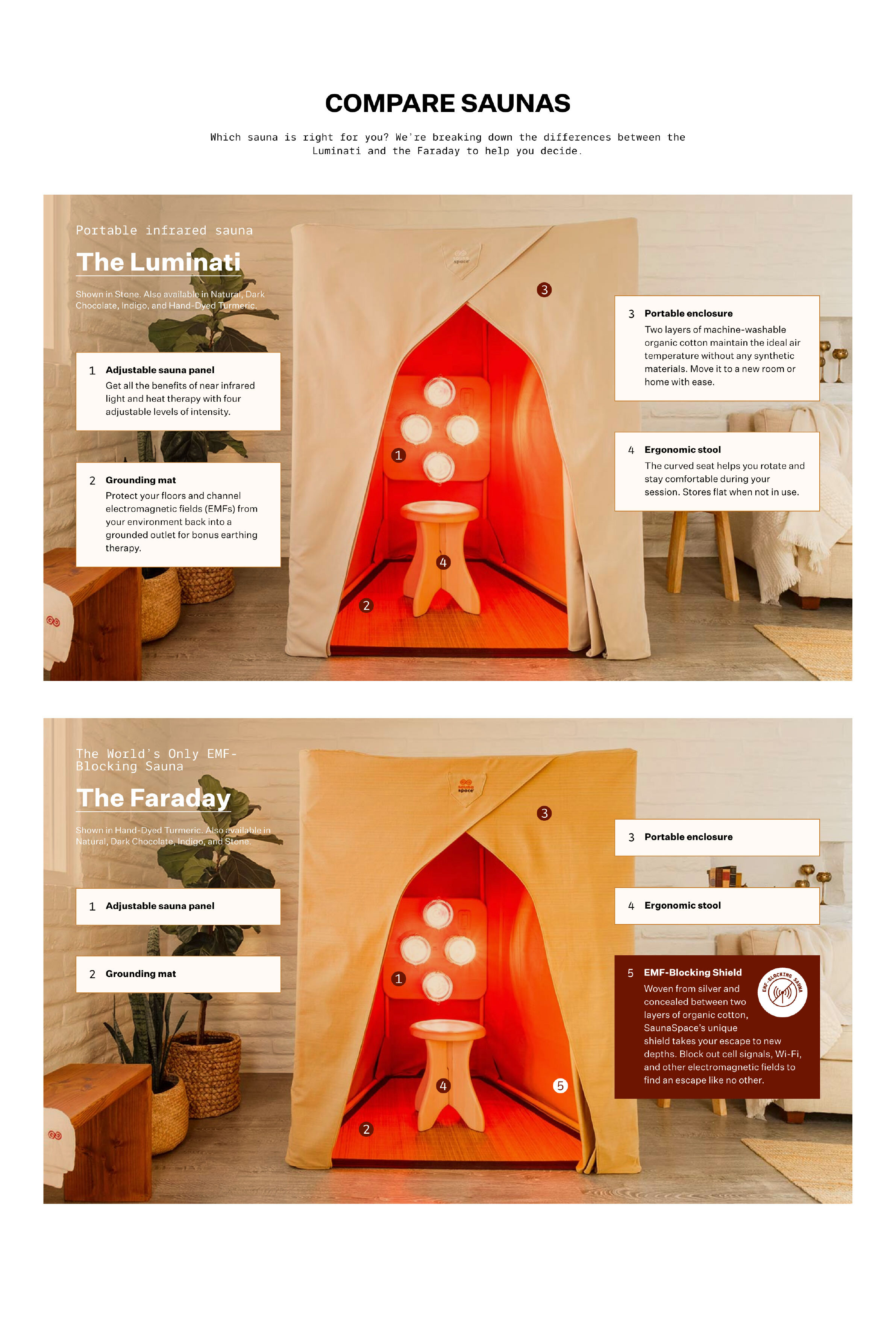
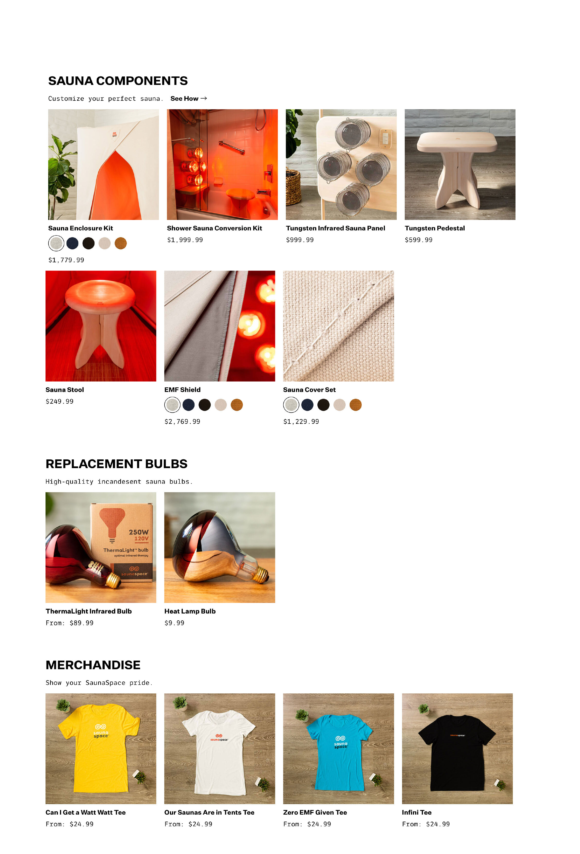
SaunaSpace came to DCG ONE with a bare bones identity system that only included a logo and color palette, and an antiquated website that didn’t represent their brand and was difficult to maneuver. They needed a full overhaul. Our team worked closely with theirs to pin down their brand pillars and tone of voice and then created the visual language to reinforce their brand and create a consistent look and feel. The site ended up being a perfect blend of experiential design to reinforce their boundary pushing mission, a completely new overhaul of their content paired with a new user experience that easily guides users through the site and allows for smooth shopping.
The Experience
As our team got familiar with SaunaSpace and their products and mission, we realized how experiential their company is and how we needed to mimic that in our design. We needed to mimic the feeling of being in the sauna. We also wanted a visual representation of how the sauna works and how it is built. That’s when I realized scroll jacking could be used to enforce the experiential elements of SaunaSpace and also to introduce how the sauna is built and what the sauna feels like. We landed on an experience where upon scroll, the sauna is built around a woman meditating in her living room. The sauna and the room around her then disappear and she is transported to Antelope Canyon, a warm cave that embodies the feeling of being in the sauna.
Moodboard Option 1: Pure Luxury
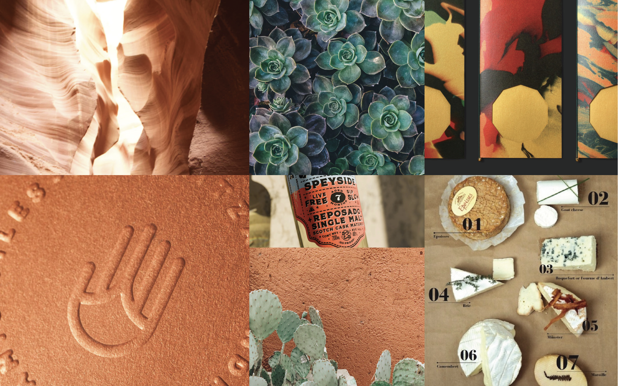
Moodboard Option 2: Radiant
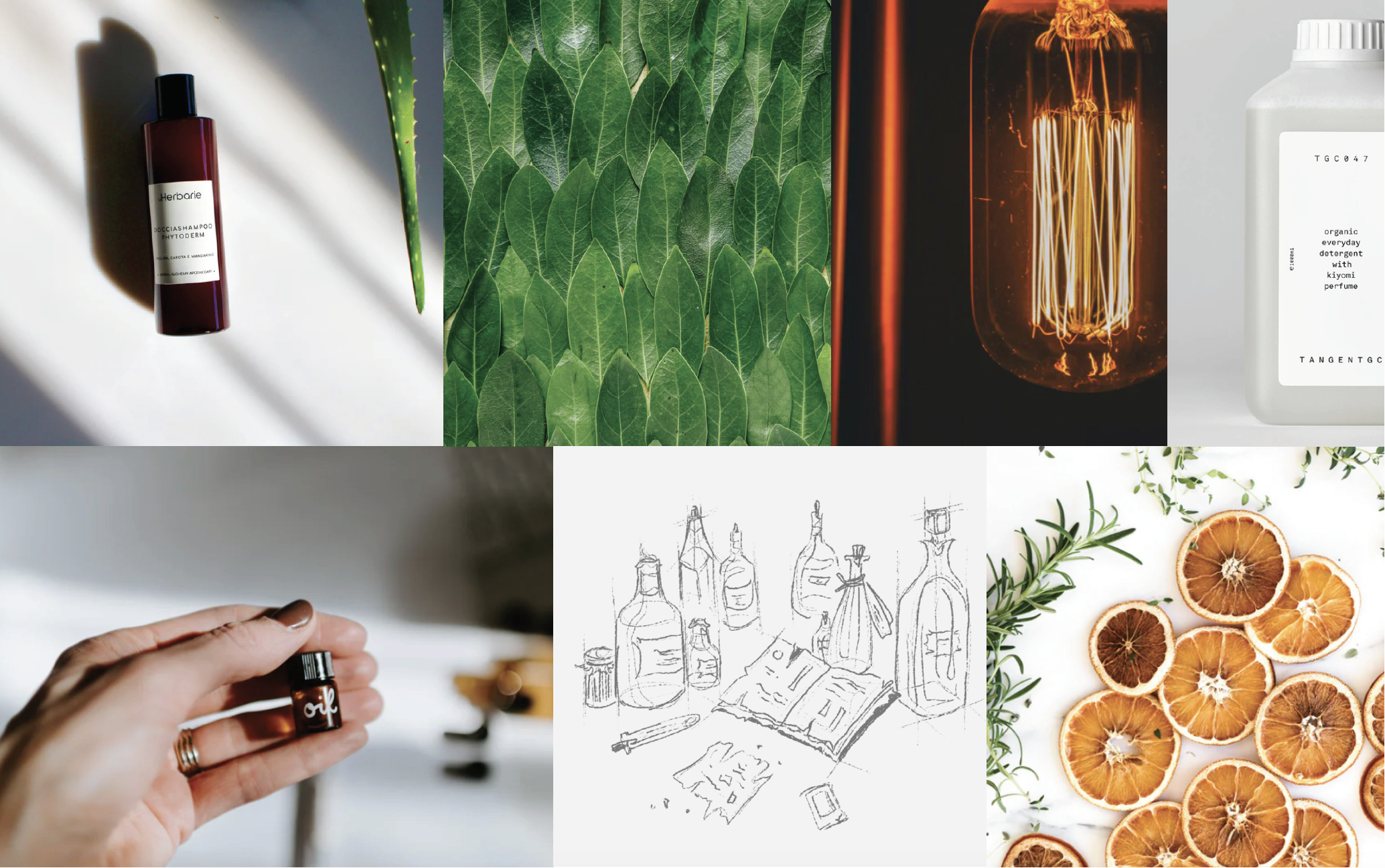
Moodboard Option 3: The Modern Apothecary
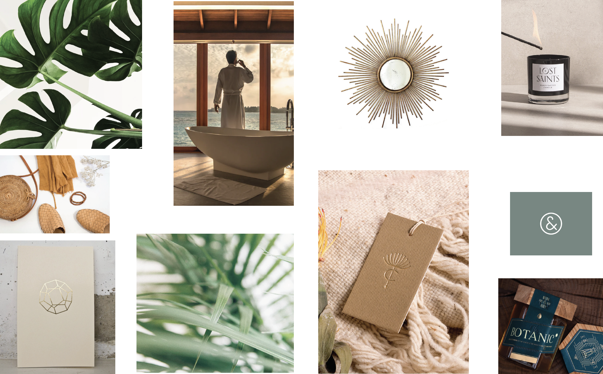
The Modern Apothecary Moodboard
As our team got more familiar with the mission and products of SaunaSpace, we all agreed that the Modern Apothecary look/feel was the most appropriate for their brand. It needed to both reflect their attention to scientific discovery as well as to natural healing and ancient practices. To achieve this visually, I used a combination of a strong sans-serif and a monospace to indicate their confidence and authority and to harken back to an earlier time and mimic notes on a typewriter. Our color palette included sunny warm yellows and oranges to reflect the lights used in the sauna, as well as browns and greens grounded in the earth. We mixed illustrative diagrams, nature-driven minimalism, clean typography, and handwriting to balance precision with craft.
Visit the site here


